Why Are Web Sliders So Useless
This post may contain affiliate links, which means I may receive a commission if you click a link and purchase something that I have recommended. Thank you!
Moving into the ’20s there are some things that I would like to improve about myself, like my diet. And then there are some things that I would just like to forget, like that time I sold websites for $25/hour, or all those times I thought web sliders were cool…
Web Sliders are not cool. Web Sliders are Useless! That’s right, I said it. Web Sliders, also called carousels are useless. I’ll go a step further: they’re a detriment to your online success and need to be left back in the ’10s. But why are they so bad and why am I so against them? Well, there’s a lot of reasons and some of them might surprise you.
Web Sliders Don’t Convert!
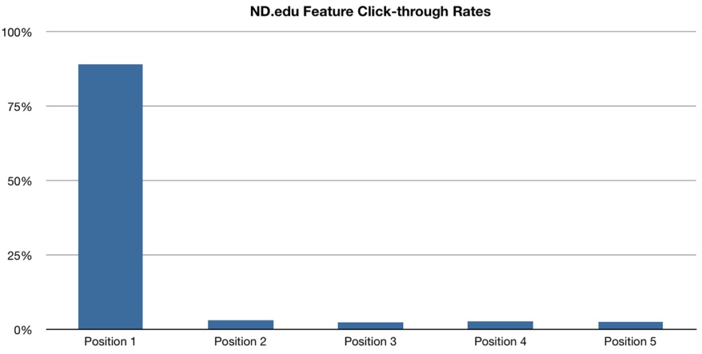
Web sliders just straight up do not convert. Well, that’s not entirely true. A study led by the University of Notre Dame found that out of 3,755,297 users, only 1% of those actually interacted with the slider in any way. And of that 1% of people that interacted with the slider, even less interacted with the second or third slide.
This is a very surprising study as pretty much every theme that was developed for WordPress in the last 10 years sports some giant hero slider in one way or another.
Web Sliders Take Up Precious Loading Time!
In a web world where loading time is everything, spending any additional time on something to load, especially something that isn’t going to convert, isn’t a hard decision to make. Don’t do it. If you want to put some giant background image on every page (kind of like the one in my footer), that photo better be darn adorable (which mine is. Fight me.) If it’s not, then what’s the point. It’s not converting, it’s making your page take longer to load, it’s not really improving the user’s experience. Why have it all?
The short answer is, you don’t need it. That’s more than just the short answer, really. That’s the hard truth.
Web Sliders Look Dumb, Especially On Mobile!
Now for something a little controversial. Web sliders look ridiculous. They fall into that category of things that just because you can do something, doesn’t mean you should. Do you remember the Space Jam website? Try to navigate that for a second with your current expectations in mind. That was out of the box thinking back then, and was commended for it by someone somewhere I’m sure… but let’s be real… it looks ridiculous.
Maybe a better example wouldn’t be the Space Jam website, but just those animated gifs from the 90s. Do you remember those? Yeah, I try to forget them too. But to me, homepage web carousels are the animated gifs of the ’10s.
And can we talk about a web slider on mobile? I’ve got these big old man hands and when I’m using my phone, the last thing I want taking up the entire top half of my screen is a huge button that takes me somewhere I’m not trying to get to. No thank you. Not only that, but they look terrible! Ugh.
Web Sliders Are Not Accessible!
Okay, back to something a little less controversial: they’re not accessible. What do I mean by this exactly? Well, the internet is used by all sorts of people. Not just people that have 20/20 eyesight, perfect hearing, and can type 120 words per minute. Your website should be usable by everyone online and a web slider just isn’t. We’ve all seen it, those small dots to indicate something is moving along, or the arrows on the left and right to let someone navigate the carousel. I’m a 30-year-old web developer, and even I think those are unnecessarily difficult to use! I just assume that my parents, whom both are vision impaired, just don’t know those arrows or dots even exist.
Seriously, Who Thought These Were A Good Idea?
Okay, to be fair, I might be being a little hard on web sliders… but I don’t think so. If you’ve ever been on a website and went to read a headline, just to have it Cha Cha slide to the left in a second, well… you know the struggle. You know what I’m talking about. That experience is straight-up infuriating, which leads me to my next point.
They Take Control Away From The User!
This should just be common knowledge at this point, but if you are on a website and it behaves in a way that you don’t expect, or you doing something causes something to happen that you didn’t ask for… well… that’s just bad UX. Like I’m trying to look at this picture and read this banner and you’re trying to sell me on something else entirely? No, no, no. I think not, Mr. Bad Website! That whole experience is just ruined.
I’m sure there are plenty of great UX Guidelines that go into exactly why you don’t want to take control away from the user, and how doing that affects their experience and all that… oh yeah, here’s one.
Can We All Please Agree To Let Web Sliders Die In The ’10s!
I’m sure there are more reasons why sliders are so bad… but I think I’ve made my point pretty clear here on why I think they’re bad and why we should never use them. Let’s make the internet a safer and prettier place in the ’20s by staying far, far away from this hopefully dead trend!
Now for a shameless plug, if you’re currently rocking that old slider life, maybe it’s time we took care of that for you. Certainly, contact me today so we can get that embarrassing JNCO Jean equivalent off your website and get you looking “fly” in the ’20s.


