Website Spotlight: Heritage Hills Nursery
This post may contain affiliate links, which means I may receive a commission if you click a link and purchase something that I have recommended. Thank you!
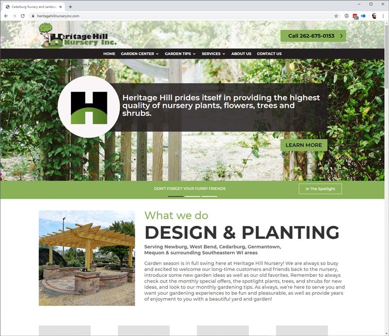
Heritage Hills is a garden and landscaping business that has been serving Newburg, West Bend, Cedarburg, Germantown, Mequon & surrounding Southeastern WI areas for nearly 30 years. I had the opportunity last season to oversee a full redesign of the website, bringing it into 2020 strong!
The Team
Heritage Hills has been a long-time customer of Valley-Technologies. I’ve been working with Valley-Technologies for 10 years now, and have been fortunate enough to have been trusted with overseeing much of the day-to-day projects moving forward.
My mentor and friend, Bette VonGunten, who is the owner and previous project manager of the company, is entering the golden years of her life and would like to retire sooner rather than later. I’m very happy for her and her talented husband, Ray, who also works with the company as a co-owner and the go-to IT guy.
As the new project manager, I’m taking all of the practices that Bette has taught me over the years and marrying them with the processes I’ve learned and developed myself.
The Process
During this project, we went through the full four-step process. We began in Discovery, where Donna, the business owner, and myself discussed what was needed for the company. We decided on a new design and much easier to use navigation. With this, and some other important items I noted along the way, we entered into the design phase.
In the design phase, my talented designer Michelle created the design that we see live on the site today. In addition to that, she created an interior page style guide that guided what buttons, typefaces, font-sizes, and other design elements would look like.
Upon the approval of the design, I started building the site in a staging environment. Like most of my websites these days, this site is a child theme of Divi.
This site is powered by SiteGround servers, which makes it load quickly and gives us a lot of power in the dashboard. The new hosting was a major improvement over the GoDaddy servers it used to be on. For more on why SiteGround is so great, check out my article on that here.
Once the site was built to completion and we had the green light, we pushed the site live on these same new servers. The process took about a month from start to finish and happened around the holiday season.

Feature Improvements
A More User-Friendly Experience
So from the very beginning of the process, I wanted to make sure that the new website was a much easier to use tool for her audience. Previously, the site was a bit clunky. It wasn’t bad for the time that it was developed, but times change. That is especially true in web design where trends come and go quickly.
Footer Improvements
On this same idea, we made some major footer improvements. I wanted the footer to include better navigation to get the user to the main pages that they would likely be looking for. To do this we, admitingly, made some assumptions based on her content. We decided on the Garden Center, Services, About, and Contact Us as well as Home for the footer navigation.
I don’t expect that this will get much use, but I do think it both looks nice and does give the user another way to navigate the site if they’ve already scrolled through the content of a web page.
More Call-To-Actions
Previously the site had very few call-to-actions. This meant that a user was expected to just go from page to page using the top-navigation almost exclusively. Because of that, tracking where a user would drop off in the sales funnel was difficult. It also meant that finding what you were looking for on the website would take many more clicks than needed. Again, this wasn’t bad for the time the site was built – but it certainly wasn’t good for a 2020 website.
Now, the site has many call-to-actions on each page. This gives the user clear instructions on what pages they should look at next, or how to get in touch with Heritage Hills. Since the business is both a brick-and-mortar and a service business, I wanted to make sure that the address was present on every page as well.
In addition to the address, we placed a Google Map on a few of the pages in the footer to really help show customers where the business was located.
A Striking New Homepage
Every great website starts with a great homepage. This is where much of the design time went into because it really sets the tone for the whole website.
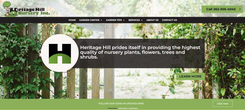
We decided to use a large portion of the above-the-fold space for a large hero image with text and a CTA that takes you to the services page.
The design also subtly updated her logo with this new H design. Because of this, we wanted to showcase that in this same section.
Slightly below that is where we added a new notices section. We have the ability to add new notices there using the custom post type, that I’ll cover a bit more later in this article. This came in handy during the coronavirus pandemic.


Two challenging layout designs
Further down the page, we have a couple of challenging layout designs. First was the “what we do” section. This section, on paper, seems very simple. But in Divi, creating these specialty sections is a little more difficult than just using their already extremely powerful page builder.
When I say challenging here, I just mean that it took longer than selecting the correct column layout type and dropping in the modules. I actually had to write some CSS for it. haha
Great Transition into Mobile
Previously, the website had a few very tall (portrait layout) photos on the homepage. Because of this, we would see nothing but those photos for 4 full view-height scrolls. On the new site, we limited that and corrected that issue with the new design.
A Streamlined Blog and Custom Post Type Dashboard
We updated the blog design significantly. This new design allows much more vertical growth between categories. We used this during the COVID-19 crisis to create a page specifically for COVID-19 posts to keep the users updated on how Heritage Hills handled the situation day by day.
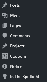
Beyond that, I created some custom post types for the common items that the website uses every month. Specifically: In The Spotlight, Projects, and Notices. Coupons also have a custom post type, but that’s powered by a plugin in this case.
Homepage Notice Post Type
As I mentioned earlier, this website design had a place for homepage notices. The idea for these was that we could have what used to be the carousel functionality, but replace it with just some informative crawl notices similar to what you’d see during a newscast.
The use-case for this was intended to be to show the “In The Spotlight” posts and monthly specials. It ended up being used for that as well as a great place to put the COVID-19 updates.
In The Spotlight Post Type
In The Spotlight has always been a weekly update that showcases a plant or plant type. It’s a way to provide useful information on the season’s best plants. In the past, this was just a post category, but with the new build, we created a whole new post type. With the new post type, we were able to do categorize the In The Spotlight posts with more useful information.

Projects Post Type
The projects post type comes with Divi out of the box. We used this post type to showcase some of the great landscaping projects that the team at Heritage Hills has completed over the years.
Coupons Post Type
The coupons post type isn’t one that is used visibly anywhere but on the individual specials posts. These special posts often have coupons with them that are printable.
Gift Certificate Integration via GiftUp
And finally, gift certificates powered by GiftUp was added to the site. This gives the end-user the ability to purchase a gift certificate that is then redeemable in their garden center.
Wrapping Up
This was a great website to work on with the team. I love working with Donna and her team over at Heritage Hills and if you’re in the southeastern Wisconsin Area, then I would highly recommend visiting them for your landscaping and gardening needs. They know what’s up.


