How To Create An Inline Email Subscription Form With Divi
This post may contain affiliate links, which means I may receive a commission if you click a link and purchase something that I have recommended. Thank you!
Have you seen an inline form powered by Divi and wondered how it was done? Wonder no more! I’ll show you exactly how I did it on my own site here! All you’ll need is a Divi license, a tiny bit of CSS understanding, and the ability to copy-paste. :) So without any further delay, let’s get right into it!
What Are We Making?

We’re going to create the layout that I have on my footer. Since I wanted First, Last, and Email forms, I decided to put the button below the input fields. But using this same method, you could make a completely inline form!
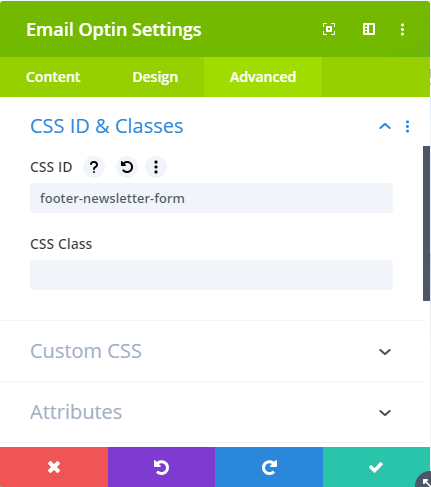
Step 1. Identify your module. I’m using footer-newsletter-form for my ID. You can name it whatever you like (as long as you update your CSS accordingly). I should note that by this point you should have already added the module to the section, and connected it to your mail provider list. :)
Step 2. Style your fields and text labels as needed. This isn’t required to put your form in this 3 column layout, so I’m not going to go into detail on how I did that specifically. For me, I just used the Divi options. :)
Step 3. Add the CSS!

<style>
#footer-newsletter-form .et_pb_newsletter_form p.et_pb_newsletter_field {
    margin-bottom: 0;
    padding-bottom: 0px;
    height: 50px !important;
}
#footer-newsletter-form .et_pb_newsletter_fields {
    display: grid;
    grid-template-columns: repeat(3,1fr);
    grid-gap: 10px;
    grid-auto-rows: minmax(50px,auto);
    margin-left: 0!important;
    margin-right: 0!important;
}
#footer-newsletter-form p.et_pb_newsletter_button_wrap {
    grid-column: span 3;
}

#footer-newsletter-form {
    display: grid;
    grid-template-columns: repeat(3,1fr);
    grid-gap: 10px;
    grid-auto-rows: minmax(50px,auto);
    margin-left: 0!important;
    margin-right: 0!important;
}
#footer-newsletter-form .et_pb_newsletter_form,
#footer-newsletter-form .et_pb_newsletter_description {
    width: 100%;
}

#footer-newsletter-form .et_pb_newsletter_form {
    grid-column: span 2;
}

</style>
Bonus CSS!
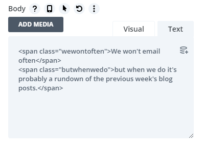
You may have noticed that my screenshot above also has some stylized text to the left of the form. And that I have that section wrapped in larger parenthesis. I did this by adding 2 spans to the text tab of the body section of the module.

<style>

#footer-newsletter-form .et_pb_newsletter_description span.wewontoften {
    text-transform: uppercase;
    color: #333;
    letter-spacing: 1px;
    font-size: 16px;
}

#footer-newsletter-form span.butwhenwedo {
    max-width: 360px !important;
    display: inline-block;
    position: relative;
    padding-right: 10px;
}

#footer-newsletter-form span.butwhenwedo:before,
#footer-newsletter-form span.butwhenwedo:after {
    font-size: 60px;
    display: inline-block;
    position: absolute;
    top: 0px;
    font-weight: 100;
}
#footer-newsletter-form span.butwhenwedo:before {
    left: -15px;
    content: "(";
}
#footer-newsletter-form span.butwhenwedo:after {
    right: -15px;
    content: ")";
}

</style>
Another Option!
When it comes to building websites, there’s always another way to do something! If what you are trying to do is create a single inline form like the one in this screenshot, then follow these steps. :)

Using the same grid system basics we used above, we’ll split the description and form into 2 unevenly split columns. The first will be 4 grid spans wide, the second will be 6.
To do this, we use our ID #join-our-newsletter, and assign it the display: grid; and grid-template-columns: repeat(10, 1ft); attributes.
Then, we use the grid-column: # span; attribute to assign the correct number of column spans to each class.
Now that those 3 lines of CSS are wrote, we are just 3 away from doing effectively the same thing to the Form field and button. Just this time, I opted to use Flex-Direction: Row; and Flex attributes.
<style>
div#join-our-newsletter {    display: grid;    grid-template-columns: repeat(10,1fr);}
div#join-our-newsletter .et_pb_newsletter_description { grid-column: 4 span;}
div#join-our-newsletter .et_pb_newsletter_form { grid-column: 6 span;}

div#join-our-newsletter.et_pb_newsletter .et_pb_newsletter_fields {flex-direction: row;}
div#join-our-newsletter .et_pb_newsletter_form p.et_pb_newsletter_field { flex: 8 0; }
div#join-our-newsletter p.et_pb_newsletter_button_wrap {flex: 0 2;}
</style>
I think this super simple example of the CSS Grid and Flex Columns shows how we can use both effectively to create super easy-to-style columns.
You can take both of these further by adding media queries to update the class row spans for mobile. Or, you could just wrap the whole thing in a media query that makes it only loads on screens 981 or larger. Then the defaults will be Divi’s mobile styles (which all are basically a single column).


